West Space 12 June – 4 July 2009
A group exhibition with work by Ryszard Dabek, Melissa Laing, The Wired Lab and Brett Jones.
Notes of objects in show
Tactile qualities are equally important to visual qualities in my texts. These texts are concerned with heightened sensory perception and experience; how we create meaning through our senses, and the signification that allows us to interpret these experiences through language. My imagining of an idea involves a careful consideration of its sensory dimensions. The idea is then developed and enacted as a kind of proof that it can exist, that it has value beyond my imagination. Yet in between my perception of an idea and my enactment of it, there exists a massive range of variations and possibilities. In this space the idea needs to retain its integrity and essence, as it evolves into a tangible manifestation. It can be difficult to transform this idea into an object and hold onto the essence. Yet somewhat contradictorily, I do not think it is the original essence that is maintained, but rather a reconstruction of it, a translation of it into form that has no precedent. Thus the form is an imaginary palimpsest, because there is no way to prove that the physical outcome has any relationship to the imagined one, yet there is a necessary and essential connection (thinking into text).
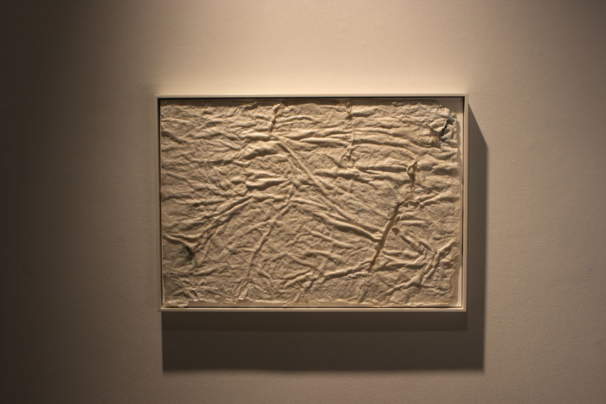
The layered paper text (Flag, 2009) is evidence of an action that did not work; an attempted casting of sand ripples in paper. This piece has become something rather intriguing; a sign of some action and labor seemingly with little purpose. The signifier (the actual object) produces several signifieds including ‘paper that has been bonded together with a tear in it’, ‘something that looks like paper that has undergone some kind of intentional or unintentional process’ or ‘a fragile paper like material that could be fabric which has been damaged’. This text has a sense of a mishap of some description, which is why I think of it as a white flag; the damaged flag of surrender, an impromptu flag made from a bed sheet. But not surrender in the sense of giving in, rather a surrender to the elements, to a process that had to be undertaken in order to prove its failure. A kind of small self-made tragedy to affect a reason for thinking, at least to justify that the thinking had an outcome. This text took on a life of its own. Through its impossible mission it became a representation of how an idea can be improvised from imagination to experience. I wanted to emphasise its ambiguity, so I removed as much sand as possible (several hours with the scalpel) and rubbed surf board wax into it as way of refining the surface. It was intentional to use the surf wax as a reference to the beach, but I did not know it had a coconut scent. Indeed this scent has added another important sensory aspect to the text (the beauty of improvisation).
I returned to exactly the same spot to do a plaster casting of the ripples in the sand. This text (Intractable, 2009) had to go through a special labor to be realized, as a continuum of Flag to which it is paired (both objects are the same overall dimensions). The first point of visualization was a photograph, then White Flag, then Intractable. The casting weighs over 30kg and had to be strapped to a trolley and wheeled back up the beach a couple of kms, then up a narrow track, lifted into my car and transported 2.5 hours back to Melbourne. It is important that this object has had a special conception and journey. This imprint is a kind of metaphor for movement and changing situations, as much as it is a representation of an idea; it is a tactile response to materiality and an environment. The signification of the ripples in the sand is somewhat confused by the smooth surface and the lines running across the ripples (created with a plastic layer in between the sand and the plaster). I am interested in subtly shifting normal signification, thus it is important that this casting may not be readable as a casting of ripples in the sand (though it could be and is implied through some actual sand sticking to a section in the corner). As an object, I would like it to convey a kind of ambivalence about its reason for being and the context of its creation.
Another idea emerged around the difficulty of representing the landscape with photography; a struggle with the notion that a photograph must capture something ‘that-has-been’ (Barthes 1980: 95). It again comes back to the problem of translating an essence into a form, and the gap in between idea and actualization. Photography has a problematised role amongst my texts as it is too easily read as an indexed representation. The production of the photograph as a (written) text may occupy a more dialectical space, at least one parallel to actual photographic prints. This text (Blue, 2009) describes the problem of looking and perceiving, of reading the signs in an image, and the viewers interpretation. The words are sand blasted into black acrylic which refers to a particular photograph (the actual photo is a reflection in black acrylic) and the location of the image (the beach). The black acrylic is also used as a device to implicate the reader in the text as an active contributor to its meaning (through reflection). The panel sits on the floor leaning against the wall because this is how the photograph to which it refers was taken while making the viewer engage more ‘physically’ with the work.
Blue is paired with an ink drawing (Blank Spaces, 2009) of the same size that references an enlarged inverted ink splash; the ink splash being the white of the paper and the background painted in black ink. As background and foreground relationship alternates, Blank Spaces is trying to translate a feeling of expansiveness, a way of looking through the black to find the white. But it is also about the quality of the ink on paper and the paradox of an inverted ink splash. The tactility of the paper surface is a larger metaphor for thinking of a landscape from above in the night sky; kind of a meshing of the black sky with the bright stars and the shifting shape of the landscape. The idea came to me after reading a text about Roni Horn. Lousie Neri refers to Horn’s drawings as having ‘blank spaces…gaps in her outline’. This simple line inspired a sartorial moment where I could see this image.